


ABOUT PROJECT
01

SmartFit is an AI-powered fitness app that delivers personalized workout plans & features an AI coach. In the original concept, users sign up, get scanned by AI, and receive a personalized program based on their goals, body type, & lifestyle. After signing up, users start working out with the AI coach, who corrects their form in real time to help them get the best results and stay safe.
For this task, I focused solely on designing the sign-up flow for the app. To view the complete prototype, click the below.
FIGMA
otype
Prot

SmartFit
Welcome to
Join Us
Sign In


9:41 AM

100%


PROJECT PREVIEW
02

Role: UX/UI Designer
Team: Group of 2
Timeline: 2 Weeks (Part Time)
Tools: Figma, Photoshop, Teams
Device: Mobile App
PROBLEM DEFINITION
03

In many fitness apps, inflexible workout plans and unclear sign-up processes overlook users’ unique needs, leading to confusion, decreased motivation, and ultimately disuse.
GOAL
04

To design a clear and efficient sign-up flow for SmartFit that addresses users’ unique needs through simple questions and an AI scan, delivering a personalized workout plan to boost engagement and motivation.
DESIGN PROCESS
05

The design process for SmartFit was guided by the Double Diamond model, a framework that shaped how I organized my work and prioritized each step.


DISCOVER
05-1

This phase began with initial research and data collection through interviews and observations to gain a deep understanding of user challenges and needs, setting the direction for the design process.
USER INTERVIEWS

What I Did: I conducted 12 in-depth, qualitative interviews to understand users’ expectations, concerns, and needs regarding the sign-up process, AI scanning, and personalized programming for the SmartFit app.Participants: I interviewed 12 people aged 22 to 55, including 4 fitness enthusiasts, 3 beginners, and 5 busy individuals with varying fitness experiences.Format: I held 20-30 minute semi-structured interviews, conducted online via Zoom.Key Interview Questions:How has your experience been with fitness app sign-up processes?What information are you willing to share during sign-up?What’s your opinion on AI body scanning for a personalized program?What concerns do you have about sharing body images with an app?How much time do you consider appropriate to complete a sign-up process?What type of information would you prefer to enter to ensure your workout program is completely tailored to you?These interviews helped me uncover the challenges and obstacles potential users face in their fitness journey, especially in the sign-up process, and how SmartFit can support them.
Competitive Analysis


App/Feature
fitbit
MyFitnessPal
Nike Training Club
Strava
Peloton App
Sign up
AI use
Lengthy, multi-step
Generic, time-consuming
Quick but shallow
Social-focused, average
Polished but lengthy
Minimal
Almost none
None
None
Limited

Personalization
Mostly for runners/cyclists
Strong for equipment users
Limited, basic data
Based on user inputs
Pre-set plans, moderate
Key Finding: Most apps struggled with lengthy sign-ups, personalization weak with AI, and minimal use of intelligent features, highlighting an opportunity for SmartFit to excel with a quick sign-up and AI-enhanced personalization.
TURNING INSIGHTS INTO ACTION

Insights from both interviews and competitive analysis revealed that users value speed in the sign-up process. As a result, I refined the goal, reducing the target completion time from 5 minutes to 3 minutes.
DEFINE
05-2
Based on my Discover phase insights where I found users struggle with complex sign-ups and lack of personalization, I synthesized the findings to define a clear problem and focus for SmartFit.
PROBLEM STATEMENT

Many fitness apps fail to provide a quick, intuitive sign-up process and highly personalized workout plans, leaving users frustrated and unmotivated to achieve their fitness goals.
KEY NEEDS

A sign-up under 3 minutes, AI-driven personalization via body scanning, and flexible workouts for busy lives.
PERsona
User

James Johnson32 YearsBusy Professional
Biography: James is a young professional with a busy work schedule who recently decided to lose weight. Due to knee and shoulder injuries, he’s looking for a home-based program he can do whenever he has time, with a coach that accommodates his injuries.
Fitness Level: Slightly Active.Goal: Weight loss.
Challenges: Complex apps with lengthy sign-ups, a packed schedule.Needs: Sign-up under 3 minutes, AI-driven personalization via body scanning, a simple home-based program with a coach that addresses James’s knee and shoulder injuries and supports his weight loss goal.
IDEATE
05-3
Using the results from the Discover phase where users highlighted struggles with complex sign-ups and lack of personalization, I defined the problem and focus for SmartFit.
IDEA EXPLORATION

I brainstormed ideas to design a clear and efficient sign-up flow for SmartFit, ensuring James can complete the process in 2.5 to 3 minutes:Idea 1- Streamlined Data Entry: James enters his information including email and questions in 1.5 to 2 minutes.Idea 2- AI-Driven Body Scan: An AI body scan detects James’s body shape in 30 seconds with simple on-screen prompts.Idea 3- Quick Plan Generation: SmartFit generates a personalized workout plan in 30 seconds with a preview for James.
DESIGN
05-4
I optimized the sign-up flow using AI-driven features to under 3 minutes and designed a program with an AI coach to help James get familiar with the app, address his knee and shoulder injuries, and support his weight loss goal.
APP STRUCTURE

I created an app structure to define SmartFit’s core structure, informed by early user insights. The goal was to ensure a smooth and intuitive navigation experience, especially throughout the Sign-Up flow.This step helped align the app’s architecture with user expectations and reduce friction for users like James who prioritize speed and clarity.
Connect to Apple Health

4.1


Splash Screen

1.
On Boarding
2.
Login / Sign Up
3.
Set Up
4.
Dashboard
5.
Primary goal
4.2
Weekly Goal
4.3
Fitness Level
4.4
Type of Exercise
4.5
Workout Place
4.6
Focus Area
4.7
Injury Area
4.8
Body Scan
4.9
Forgot & Reset Password
3.1
USER FLOW

I mapped James’s Sign-Up journey with a flow from Splash Screen to Plan Preview, ensuring a smooth process in under 3 minutes and initial familiarity with the app.


Start
Splash Screen
Sign Up
Sign In
Onboarding
Onboarding
Connect to Apple Health
Questions
Select Focus & Injury
Areas
Body Scan
Data Review
Analysis
Dashboard
Show Apple Health Data
Yes
No


5 pages
AI generates personalized plan
Check info
Back/ Skip/ Continue
Back/ Skip
Back/ Edit/ Continue


Skip/ Next
3 pages
SKETCH

I started with quick rough sketches to brainstorm and visualize the Sign-Up flow, ensuring I could rapidly iterate on ideas before moving to digital wireframes.
Initial Introduction
Authentication


SmartFit
SmartFit
Enter your email address to register or connect your email aoccount.
Connect Your Email

Email Address

Password


Next
SmartFit

Next


Connect Apple Health


SmartFit

Next
Questions


Sign Up/ Sign In
Data Collection
Body Scan By AI
User Dashboard
Analysis & Planning
- Connect to Apple Health
- Questions
The final input stage where AI scans James’s body to gather physical data.
Analysis of data from Questions, Health App, and Body Scan creates a tailored workout plan for James by analyzing all collected data.
SmartFit

Next
Body Scan
SmartFit

Next


Your plan is getting ready


SmartFit
Welcome to your dashboard.


Your Workout


DESIGN DECISIONS

To improve James’s sign-up experience, I made key design choices:
- I focused on enhancing his experience during the sign-up process under 3 minutes.
- I used a minimalist layout with large, tappable buttons to simplify navigation for his busy schedule.
- I added progress indicators to enhance process clarity and improve the user experience.
- I designed clear on-screen prompts during the AI scan.
- I implemented a step-by-step process with AI body scanning to minimize text input and quickly deliver a personalized workout plan for his weight loss goal.
WIREFRAME

I created mid-fi wireframes to visualize the Sign-Up flow for SmartFit, focusing on a simple and intuitive layout for James.
Doc Appointment


9:41 AM

100%


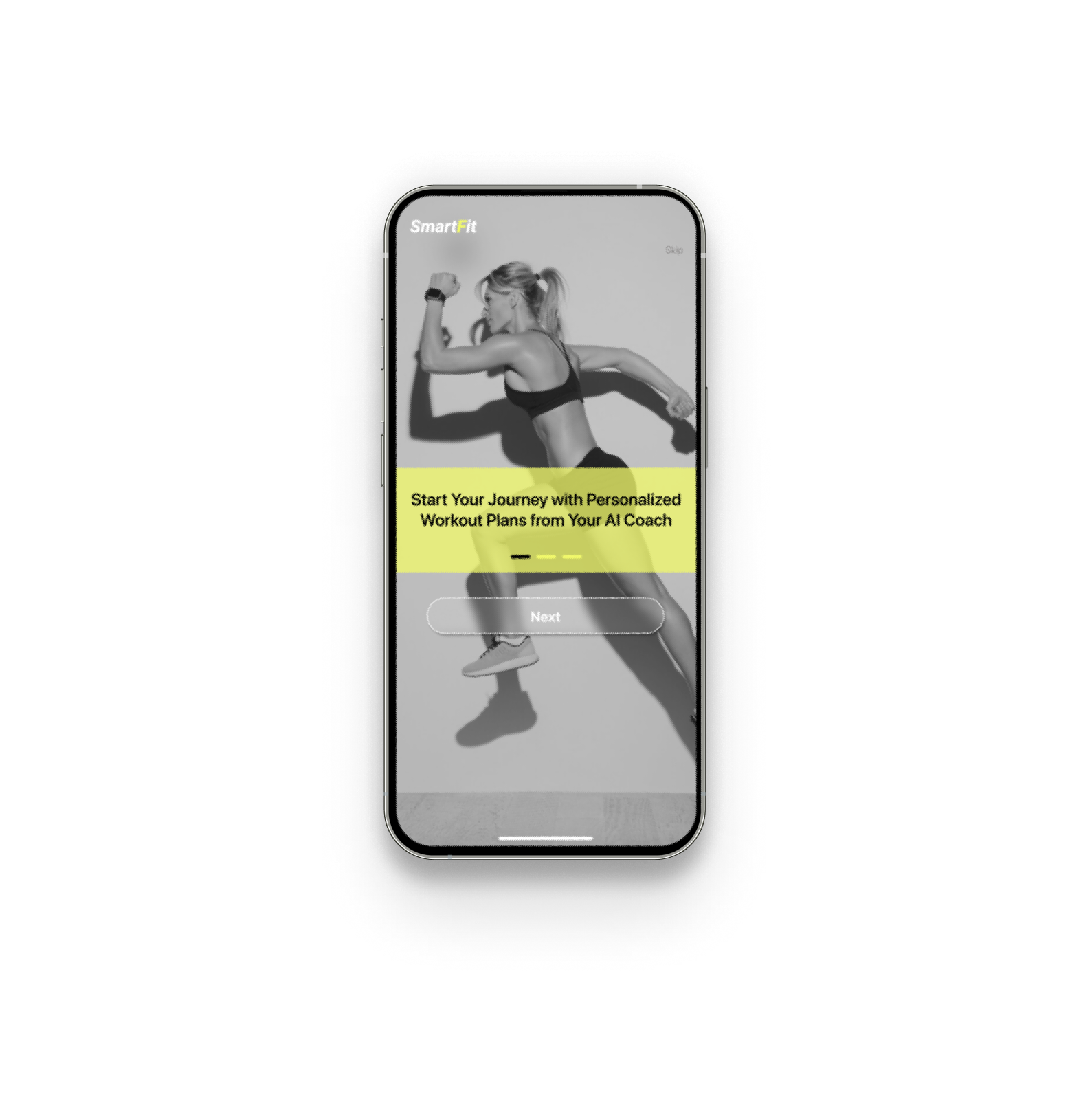
SmartFit
Start Your Journey with Personalized Workout Plans from Your AI Coach
Next
Skip

Doc Appointment
Connect
Skip

9:41 AM
100%
What is your primary goal?

Back


Lose Weight

Build Strength

Gain Weight

Reduce Stress

Improve Health


Doc Appointment
9:41 AM
100%


SmartFit
A community For You,
Challenge Yourself
Get Started
Doc Appointment
9:41 AM
100%


SmartFit
Password
Confirmation Password
Sign Up
PERSONALIZED WORKOUT PLAN
Or


If you have an account? Sign In here
Doc Appointment
9:41 AM
100%


SmartFit
Find Nutrition Tips That Fit
Your Lifestyle
Next
Skip
Doc Appointment
Connect
Skip
9:41 AM
100%
Do you have any current or past injuries?
Back
No injuries
Shoulder
Back
Knee
Hip
Elbow
Wrist
Neck


Doc Appointment
Manually Setup
Skip
Connect
9:41 AM
100%
Allow SmartFit to access Apple Health for precise activity insights
Enrich Your
Fitness Experience

Doc Appointment
Connect
Skip
9:41 AM
100%
Which place do you prefer for your workout?
Back
Home
Gym

Outdoors
Doc Appointment
Connect
Skip
9:41 AM
100%
What is your primary goal?
Back
Lose Weight

Build Strength

Gain Weight

Reduce Stress

Improve Health
Doc Appointment
Connect
Skip
9:41 AM
100%
Do you have any current or past injuries?
Back
No injuries
Shoulder
Back
Knee
Hip
Elbow
Wrist
Neck
Doc Appointment
9:41 AM
100%
Form Analysis
Back
Start with the front
Scaning...


Doc Appointment
Connect
Skip
9:41 AM
100%
Which area would you like to
focus on?
Back


Full Body
Biceps
Abs
Quads
Forearms
Chests
Shoulders
Traps
Doc Appointment
Connect
Skip
9:41 AM
100%
Which area would you like to
focus on?
Back
Full Body
Biceps
Abs
Quads
Forearms
Chests
Shoulders
Traps

Doc Appointment
Connect
Skip
9:41 AM
100%
Which place do you prefer for your workout?
Back
Home
Gym

Outdoors
MOOD BOARD

I created a mood board to set SmartFit’s visual direction, inspired by dynamic and energetic styles that reflect the goal to boost energy. The color choices for the app were selected based on a vibrant palette, including bold black and yellow, to convey motivation and clarity.


I used a bold color palette of black and yellow for a high-contrast, energetic look that motivates James, with yellow buttons highlighting key interactions and encouraging action, complemented by green and light gray accents to enhance the fitness vibe.
Typography
Colors
&

Secondary
#151515
Secondary
#15151A
Neutral
#FFFFFF
Primary
#F1F96B
Accent
#B1B0B0
I chose the modern SF Pro Display font for its readability and clean, professional look, aligning with SmartFit’s energetic and user-friendly vibe.
Aa
Zz
SF Pro Display
- Title: Semibold - 16 px
- Regular - 20 px
- Headline: Bold - 20 px
- Body: Regular - 12, 16 px
Deliver
05-5
In the Deliver phase, I created an interactive prototype of the Sign-Up flow for SmartFit and tested it to ensure it meets James’s needs for a quick and energizing experience.
PROTOTYPE
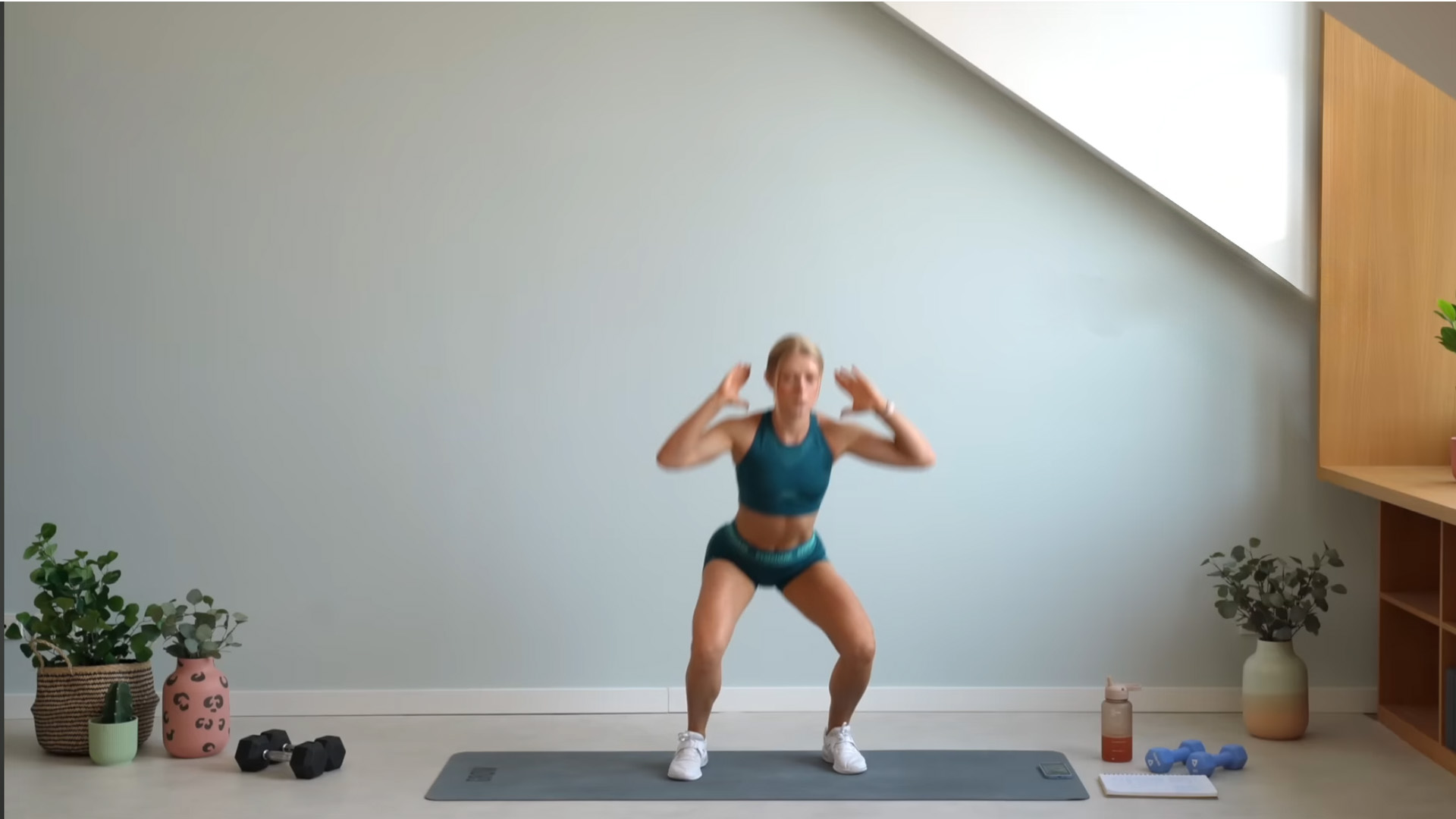
I built an interactive prototype in Figma to visualize the Sign-Up flow, enabling James to complete the process in under 3 minutes. The prototype includes onboarding screens, data entry steps (health data integration, goals, schedule, focus and injury areas), a 30-second AI body scan with clear prompts, and a personalized plan preview with a 'Start Now' button, all designed to deliver a seamless and energetic experience.
SmartFit
Workout with AI coach

Scan Me
USABILITY TESTING & ITERATION

I conducted usability testing with 5 users to evaluate the Sign-Up flow and identified some issues. The goal was to ensure James could seamlessly complete the process. I then iterated the design to create a smoother flow, addressing the problems to enhance the experience.


A community For You,
Challenge Yourself
Get Started
SmartFit

A community For You,
Challenge Yourself
Get Started
SmartFit

Skip
Problem: The Onboarding flow lacked Skip and Back options. I observed that some users wanted to skip certain steps, while others wanted to revisit previous pages to review information more carefully. This lack of flexibility caused friction and increased the risk of drop-offs.
Solution: I added Skip and Back buttons, giving users greater control over the Onboarding experience and allowing them to navigate the flow according to their needs.


What time of day do you prefer to exercise?

Morning

Afternoon

Evening
Continue


9:41 AM

100%

Skip
What is your typical workout duration?
15-30 minutes
30-45 minutes
45-60 minutes
Continue


9:41 AM

100%

Skip
What motivates you the most to stay active?
Lose Weight


Feeling Energized

Improve Health
Continue
9:41 AM
100%

Skip
Which area would you like to
focus on?


Full Body
Biceps
Abs
Quads
Forearms
Chests
Shoulders
Traps

Continue
9:41 AM
100%


Skip
Do you have any current or past injuries?
No injury
Shoulder
Back
Knee
Hip
Elbow
Wrist
Neck

Continue
9:41 AM
100%
Your plan will improve your fitness while protecting these areas.


Skip
Which area would you like to
focus on?
Full Body
Biceps
Abs
Quads
Forearms
Chests
Shoulders
Traps

Continue
9:41 AM
100%
Skip
Do you have any current or past injuries?
No injury
Shoulder
Back
Knee
Hip
Elbow
Wrist
Neck

Continue
9:41 AM
100%
Your plan will improve your fitness while protecting these areas.

Skip
Problem: The Sign-Up process contained too many questions, which caused user fatigue and led to higher drop-off rates. This resulted in incomplete data collection, making it harder to generate accurate workout plans and reducing the overall user experience.
Solution: I reduced the number of questions, asking only the key ones necessary to generate a workout plan. I moved the remaining questions to the user dashboard, allowing users to answer them at their convenience, which ensured more accurate data collection and an improved Sign-Up experience.
Solution: I modified the design of the Full Body option in the Focus Area and the No Injury option in the Injury Area to differentiate them from other selections and make them more easily recognizable. I used two distinct, bold colors to separate the words Focus and Injury, ensuring they stand out when the user navigates to the next screen, which clarified interactions within the Focus & Injury Area section and improved the overall user experience.
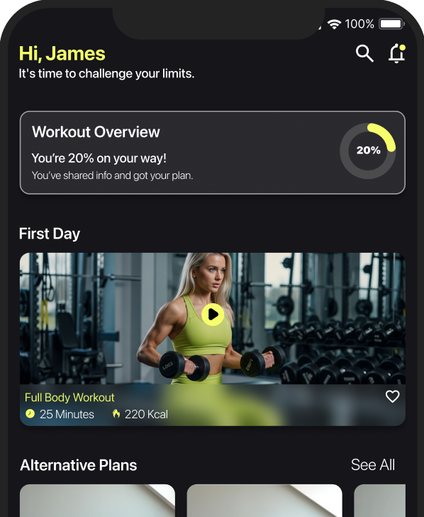
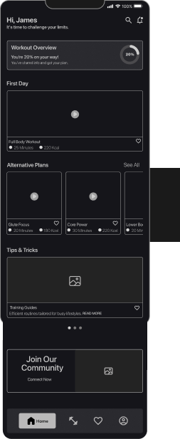
Doc Appointment
Workout Overview
You’re 20% on your way!
You’ve shared info and got your plan.


20%
Training Guides
READ MORE
Efficient routines tailored for busy lifestyles.

Supplements
READ MORE
Essential supplements to enhance your fitness journey.


Nutrition Tips
READ MORE
Simple, actionable advice for a balanced diet that fuels your body.


Tips & Tricks
First Day
Full body Workout
220 Kcal

25 Minutes


Join Our
Community
Connect Now


Alternative Plans
See All
Core Power
30 Minutes
220 Kcal

Lower Body Sculp
20 Minutes
180 Kcal
Glute Focus
20 Minutes
180 Kcal

Home


hi, James
It's time to challenge your limits.


9:41 AM
100%
Problem: In the Focus & Injury Area section, users could click on different body parts to specify their focus or injury areas. However, the Full Body option in the Focus Area and the No Injury option in the Injury Area were identical to other selections and not noticeable to users. Additionally, due to their similar appearance and placement one after the other, the Focus and Injury pages often led users to fail to distinguish between them, thinking the Injury section was a continuation of the Focus section.

FINAL OUTCOME
06
The final prototype successfully implemented a Sign-Up flow for SmartFit that James completed in less than 3 minutes. Its energetic design, featuring bold black and yellow colors and intuitive prompts, not only provided a seamless experience but also supported James’s fitness goals weight loss and injury management by fostering motivation and confidence from the very first interaction.
REFLECTION
07
This section summarizes key insights, challenges, and improvements from the project, highlighting what worked well and guiding the next steps to enhance the user experience.
LearningsThe importance of early testing to identify issues quicklyDesigning based on real user needs and feelingsBetter understanding of users’ real needs through testing and feedbackImprovements / ChangesStart testing at earlier design stagesReduce the number of sign-up questions to improve UXSuccesses / ChallengesSuccess: Clear sign-up flow that reduced cognitive load, especially for JamesSuccess: Adding Skip and Back options in onboarding increased user satisfactionChallenge: Balancing sign-up questions with sufficient data collectionChallenge: Limited time for testing and gathering user feedbackNext StepsImprove website for easier dashboard accessAdd Gamification features to increase user motivation